Data Exploration: How Will it Help You Catch Low Hanging Fraud
You decided to start using fraud detection on your landing pages. Then what?
Our clients care to spend their budget wisely, that’s why they monitor their landing page for any fraudulent activity. This means that they continuously use the Oxford Biochronometrics fraud status feedback to validate and re-optimize their campaigns to get rid of fraud. But, how do they do that? At first by exploring the data collected at their landing pages. More specifically by looking at charts containing the metrics and analytics. These charts answer the basic questions, such as:
● Which source has too many fraudulent clicks and fraudulent generated leads
● What operating system yields the best result: Android vs. iOS? Windows vs. Mac OSX?
● Are (paid) visitors arriving at my landing pages from the targeted geo? Both human and fraud
● How long do visitors stay at my landing page? Broken down by duration, human and fraud
● Which app is bringing too much fraudulent visitos to my landing page?
These are just a selection of a few basic questions, which can be answered by exploring your own campaign data. The data is presented in stacked bar charts and are color coded in FouAnalytics style. This color coding is the best way to break down the quality of the traffic in what is human and what is fraud, and everything in between. The charts can be displayed in different timeframes which enables you to zoom in and out to specific events, like campaign starts, the moment an email was sent to subscribers, etc. The supported timefames are 5 minutes (M5), 1 hour (H1), and 24 hours (D1). Below each chart a series of timestamps is shown and a volume bar to show how much traffic was arriving at your landing page at that point in time.
In Figure 1 each bar represents an hour and it shows how different Operating Systems perform in terms of traffic quality. Figure 2 does exactly the same but now for different browser types. In Figure 1 you can clearly see that GNU/Linux is completely red meaning: fraud. iOS looks very clean (blue); Windows, Mac and Chrome OS have daily spikes of fraudulent visitors. In Figure 2 (the browser types) Chrome shows a lot of fraud, but only during the night when human are sleeping. We’ll park this knowledge and look at some other charts before drilling down on this.


How do different apps perform? Let’s take a look at 3 popular apps and compare the results. In Figure 3 the three charts show how and what visitors originating from Instagram, Facebook and TikTok look like. Again, an hourly chart. You can clearly see that during the day when the green volume bar chart shows high volume TikTok is bringing much more fraudulent traffic to the landing page than Instagram and Facebook. This information enables you to calculate your true CPM, CPC, CPL and eventually the CAC (customer acquisition cost) which will be ~15% higher purely based on the fraud%; add to that fake leads polluting your systems, disputes due to TCPA violations, etc. In short: You should get 15% discount, credit traffic, or whatever form of compensation but you shouldn’t be paying for fraud!

Large companies running digital marketing campaigns costing multiple millions a month don’t put all their money on a single source, or campaign. They run multiple campaigns at multiple sources to attract a variety of visitors. It is important to measure and compare and benchmark these sources, because it enables you to dynamically reallocate your budget to the best performing source, and you could open the discussion with the source and ask questions why they had X% fraud last month. Below a few examples of the differences between the performance of the sources. By the way, you could perfectly continue doing business with a source having 40% fraud as long as you don’t have to pay for the fraudulent parts, but key is: You have to be sure that the fraud detection does its work correctly and accurately.

The first four charts were a few examples of the low hanging fraud.. ehrmm, fruit. Looking at the same data in a more elaborate way is to combine segments to break down the data into more groups. The example in Figure 5 breaks the data into Operating System combined with the browser type used. Figure 1 above showed that Windows has a lot of fraud, but that doesn’t help you much. Figure 5, again 60 min chart, shows that Edge on Windows has a lot of fraud and also a weird volume bar, every ~4 hours a spike which is not how humans arrive at your landing page. Also a lot of the other combination charts show spikes of bots, except iOS+Safari and Android + Samsung browser.

It also shows that Chrome on Linux is the reason why Chrome as browser type has quite some fraud. Also, it is good to see that all Headless Chrome visitors have their own chart which is 100% red!
So, what else?
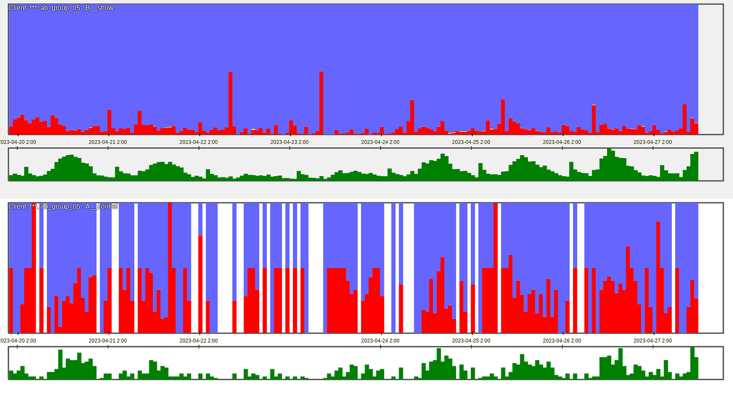
You could see how well your normal visitors and/or fraudsters perform in your A/B tests? Figure 6 shows the AB groups as the test and the control group. And fraud is a large part of one of the groups. The next question would be: What are these visitors, which can be answered by breaking down the data in multiple groups, eg. AB test + country, or AB test + source, etc.

Another way of looking at your visitors is by looking at the user interaction behavior, which shows that (human) fraudsters have typical behavioral quirks. When measuring and looking for different types of quirks you can clearly see that fraudsters try to do their work as efficiently as possible compared to regular visitors, which are often first time visitors. Other cases are botnets; Compared to humans they have a completely distinct behavioral interaction.

The last one is a D1 chart, where each bar represents a full day. It shows how submitted leads generated by different sources and how fraud evolves or is addressed over time. It shows that some sources have no fraud at all, or the two sources at the bottom which clearly had a scalability problem. As shown in the charts: By re-optimizing and re-configuring your campaign, simply by removing the poor performing campaign parts, fraud can be avoided.

Charts and analytics based on quality fraud detection with high accuracy (that means no false positives and no false negatives) are perfectly suited for data exploration in order to know what is going on at your landing pages. Once you have eliminated the low hanging fraud you should immediately see a boost in your campaign performance.
Of course, you could feed the real-time fraud status feedback loop directly into you back-end alerting when the fraud exceeds some threshold. You could even use machine learning to optimize your campaigns, but not all our clients run the volume to justify this, and even if they do they might not have the staff to build and maintain such an alerting system. So, that’s why they look at the fraud charts regularly, as the best alternative.
Any questions? Just leave a comment or send me a DM.


